Perfect Home Color Schemes: Undertones, 60-30-10 & Flow
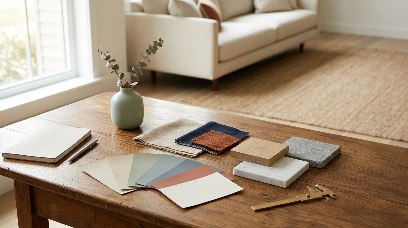
The Smart Guide to Perfect Color Schemes: A Practical System for Confident Home Decor
Choosing colors for a home can feel high-stakes: paint is permanent, lighting changes everything, and one “almost right” shade can throw off an entire room. A calmer approach is to use a repeatable system—starting with what can’t change, then building a palette with clear jobs—so every decision has a reason and rooms connect naturally. For more guidance, see Free Guide: Color Psychology for Interior Design.
Start with the three anchors: light, fixed finishes, and mood
Before you pick a single paint chip, lock in the realities of the space. These anchors prevent the classic problem of falling in love with a color that only works in someone else’s house. For further reading, see 6 books for using colour in interior design.
- Map natural light by time of day. Note what the room does in the morning, midday, and evening. North-facing rooms often read cooler and flatter; west-facing rooms can go golden and dramatic. Write down whether the light looks warm (yellow/golden) or cool (blue/gray).
- List fixed finishes you’re keeping. Flooring tone, countertops, tile, brick, large upholstery, and wood species all “vote” on what looks right. Put these items on the table—literally—by gathering samples or clear photos.
- Choose the mood in one sentence. Examples: “calm coastal,” “moody library,” “bright modern,” or “soft vintage.” A single line keeps you from collecting random colors that are pretty but unrelated.
- Pick one non-negotiable item. A rug, artwork, or patterned fabric can serve as the palette’s truth source, especially if it includes multiple tones you can pull from.
Build a reliable palette: 60–30–10 with a twist
The 60–30–10 rule works because it assigns proportion. The upgrade is adding a “bridge color” so layers transition smoothly instead of competing.
- 60% base: walls and large surfaces. Prioritize undertone compatibility with fixed finishes, not just “light vs dark.”
- 30% secondary: big textiles and furniture (sofa, drapes, bedding, area rug). Use this layer to introduce contrast—lighter/darker, warmer/cooler, or smoother/more textured.
- 10% accent: small but high-impact touches (pillows, vases, lampshades, frames). This is where personality lives.
- The twist: a bridge color. Pull a mid-tone from art or patterned textiles to connect base and secondary without clashing. It’s especially helpful when you’re mixing warm woods with cooler paint, or vice versa.
- Keep accents consistent across adjacent spaces. Repeating one metal finish, one black/ink tone, or one color family creates flow without making every room identical.
Undertones made simple: warm vs cool vs neutral
Undertone is the hidden color cast that makes a “neutral” look creamy, pink, green, or blue once it’s on the wall. Getting undertone right is the difference between cohesive and “something feels off.”
- Warm neutrals (cream, camel, warm greige) pair naturally with honey oak, brass, terracotta, and warm white trim.
- Cool neutrals (crisp white, cool gray, blue-gray) pair well with chrome, cooler marbles, ash-toned woods, and charcoal.
- “True” neutrals still lean slightly. Test next to the fixed finish (flooring/counter) rather than in isolation.
- Use the white paper test. Place bright white paper beside a paint chip to reveal hidden pink, green, blue, or yellow casts.
- Avoid stacking multiple strong undertones. If one undertone is bold (like a green-leaning gray), keep the rest quieter so the room doesn’t feel unsettled.
For deeper color education and curated systems, the Sherwin-Williams Color Education hub and the Pantone Color Institute are reliable references.
Room-to-room flow: one home, many moments
Whole-home harmony doesn’t mean every room matches. It means the transitions feel intentional.
AI color palette checklist: turn inspiration into a usable plan
Color Scheme Starter Matrix
| Room | Base (60%) | Secondary (30%) | Accent (10%) | Best finish/texture cue |
|---|---|---|---|---|
| Living room | Warm off-white | Taupe or oatmeal | Deep olive or ink blue | Matte walls + textured linen |
| Kitchen | Soft white | Light oak or greige cabinetry | Black or aged brass | Satin cabinetry + warm metals |
| Bedroom | Muted greige | Soft clay or dusty rose | Walnut or charcoal | Matte paint + plush textiles |
| Bathroom | Clean white | Stone gray | Forest green | High-gloss tile + matte paint balance |
| Home office | Pale neutral | Mid-tone blue-gray | Cognac leather | Low-sheen walls + warm wood |
Common pitfalls and quick fixes
Using the digital guide for faster decisions
For a streamlined, printable system that keeps notes, undertones, and sample results in one place, use The Smart Guide to Perfect Color Schemes (digital download) to move in order: anchors → palette roles → room flow → physical testing. A quick “one-minute audit” helps finalize: undertones aligned, contrast intentional, and accents repeated for cohesion.
To make the process more enjoyable while you plan, a comfort-forward detail like the Cute Apple House Kitten Plush – Soft Detachable Cat Plush Toy can double as a playful accent on a reading chair or bedroom shelf—especially in warm, cozy schemes with soft reds, creams, and gentle greens.
FAQ
How many colors should be in a room color scheme?
Three to five total colors (including neutrals) is a practical target: a base, a secondary, and one or two accents. Defining each color’s job—and repeating accents a few times—keeps the room from feeling busy.
Why does a paint color look different in my home than in the store?
Lighting temperature, the direction of natural light, surrounding surfaces reflecting color, and even paint sheen can all shift how a color reads. Test large swatches on multiple walls and look at them in daylight and at night under your real bulbs.
What’s the easiest way to make different rooms feel connected?
Create a whole-home palette with shared neutrals and 2–3 repeated accents, and keep trim consistent. Where rooms are visible together, repeat at least one element (a bridge color, a metal finish, or a wood tone) to make transitions feel intentional.












Leave a comment